
First, a disclaimer. Just about all editing is done using GIMP. Maybe I could have afforded a commercial software package. But with GIMP being so powerful, and with my usage of these for purely occasional entertainment purposes, I felt GIMP is more than adequate for me.
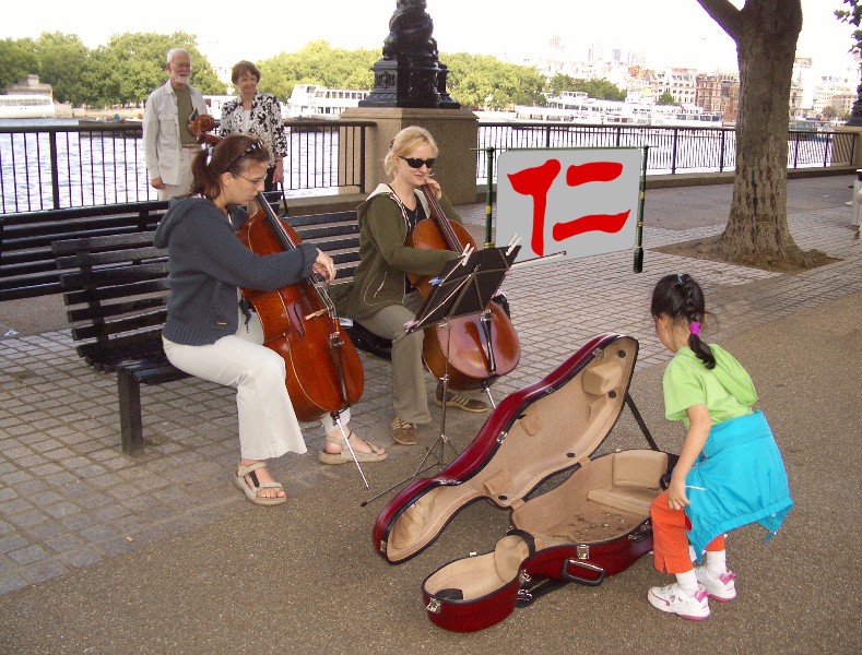
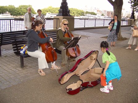
I started with this nice picture (shown to the right) that Agnes took in London, by the Thames River. The image fits the theme, and is rather nicely composed. The original image is rather large, about 4 million pixels. I like that, for it can be used for creating a reasonably large final print.
When we look at the image, there are a couple of things that gets unwanted attention, after noticing the main characters. First, there are a couple of people standing to the far right, one of them happened to be cropped half way out of the image. This is distractive. A lesser annoyance is the plastic bag on the bench, behind one of the players. We decided to remove these. On the other hand, the couple behind the artists are just fine where they are.
Because we have no other material that fits the scene (for example, an identical picture taken some five minutes from that moment), we have to make do with what we’ve got within this picture. That is, we kind of have to “cut-and-paste” from somewhere in the image to somewhere else, and therefore erasing whatever is there at the “somewhere else”.
There is a better tool to use in GIMP for this purpose than “cut-and-paste”.
This is the cloning tool, which shows up in the main GIMP window (the panel with
a bunch of tools) as  , which I guess
stands for the rubber stamp. To use it, first we “control-click” to get the source
location, then use the current brush to copy the source area to the destination
area. I use a big brush to begin with, and use a smaller one for finer things,
such as defining the edges.
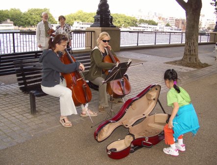 The
result, after several iterations of cloning, is shown to the right. To achieve this
much, it’s important to be patient, and to work in small steps — for
example, the “revealed” tree truck and railings cannot be cloned in
one single step. Similarly, the tiles on the ground must be carefully lined up.
What I didn’t do here is to try to make the tiles come in properly
foreshortened sizes. That, I judged, is an extra step of work that is not
warranted here. Also, I thought the brightness changes in the tiles seemed to
show that the ground is somewhat dirty, and would have embarked on an extra
hour of labor to make it come out more uniformly, but my dear wife lovingly
forbade me from undertaking that.
The next task is to make a sign that says “benevolence”. Previously we have decided to use a Chinese li-script font to write all the words. To make it into a sign that fits in the environment of this picture, we have to choose some support that is English. (Not the language, but the place.)
Unfortunately I couldn’t find an image of our own authorship for this task. So I resorted to Google images. Although there weren’t many good choices, we did find a suitable one, of an English gas lamp. There are a few things that needs correction in this particular gas lamp, if we are to use it as our sign post:
(a) I do an auto-select using one the selection tools. It does not matter which one, because in this case none of them can work out that well;
(b) I turn on the quick mask, which is the little tool in the lower-left corner of the image window;
(c) I edit the selection, which is represented by the red transparent overlay, until it is in my judgment perfect. The quick mask is edited as if it is a binary (two colored: red and transparent) image;
(d) I unselect the quick mask; and
(e) I create the layer mask based on the selection.
Now I am ready to make my sign. I created a rectangle with round corners, using the Drawing tool in Microsoft Word. I fill the inside of the shape with a neutral gray color, and put in the Chinese character for benevolence. The choice of the gray color is such that the sign can fit into the place where we intended for it, in the shade on the river bank. This shape is then copied to GIMP. To do that, I make a screen capture of the shape as displayed by Microsoft Word, using the Windows Alt-Prnt Scrn key combination, and paste it into GIMP as a new image. Then I crop off the excess stuff, mask away the background, and make the character red by a flood-fill.
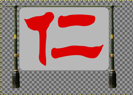 Now I am ready to put the sign
together. I start a new image, paste in two copies of the lamp post, and a copy
of the sign. The sign is pasted into a new layer (create a new transparent layer
after pasting), so that I can adjust its size to fit the posts. The result is
shown to the right. Well, almost.
What is missing is the “hardware” to hold onto the sign. For the top, I created a horizontal bar by making a copy of the decorative bar on top of the lamp post, and stretched it to fit the size. For left and right side, I copied a small piece of the brass ring on the lamp post and stretched it sideways, giving the impression of a couple of flat horizontal pieces of hardware. I was also thinking of adding a few fasteners on the sign itself, but my dear wife again set my mind straight.
Finally, it’s integration time. I copy this sign with post and all into the picture that I prepared previously, add a new transparent layer to hold it, and use the perspective tool to make it fit into the place, with the right perspective too.
To make it fit nicely, I have to mask the new layer so that some of the things in the old image that should be in front of the sign had it really been there can show through. I start off with a layer mask that is a copy of the alpha channel, copy the layer mask into a selection, make the selection into a quick mask, and start editing the quick mask while hiding the new layer that holds the sign. Once this is done, the process is reversed, by removing the quick mask, deleting the layer mask for the new layer, and recreating it using the selection.
Phew! That’s not too bad, is it! The final result is shown below.
